Primary Logos
The primary logo should be used in most circumstances to ensure brand consistency.
The primary logo should be used in most circumstances to ensure brand consistency.


Full name logos must only be used when the full company name is required for clarity, such as in booth designs and on enrollment sites. In almost all situations, the primary DEP logo should be used for consistency.
Black and white DEP logos should only be used when the signature triangle is hard to see on the background. Steps should be taken to try and increase legibility of the blue triangle on the background before choosing the black or white triangle versions






The Everest logo may be used with or without the DEP logo. If the DEP logo isn’t present in the design, the “by Dealer eProcess” version should be used.




When locking up the DEP and Everest logos, a pike should be used to separate them horizontally. Logos should not be vertically stacked.



Minimum spacing around the primary logo should equal 2x the width of the triangle on all sides, and the width of the lowercase e on the secondary logo. The clear space should scale with the logo.
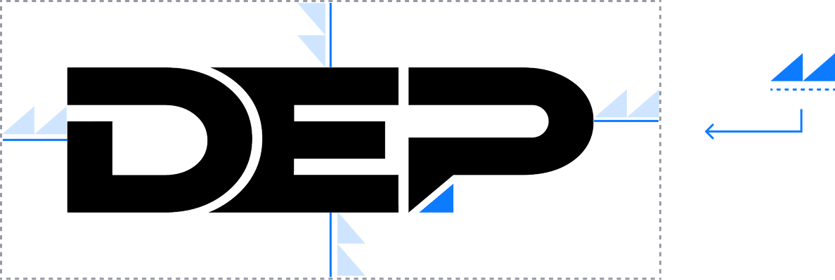

Logos must not be made smaller than their minimum sizes to ensure legibility. Sizes will vary for print and digital applications. Ensure that the blue triangle is able to be distinguished from the background.
Print Min Height: 1/4 in.
Web Min Height: 15px

Print Min Height: 1/8 in.
Web Min Height: 10px
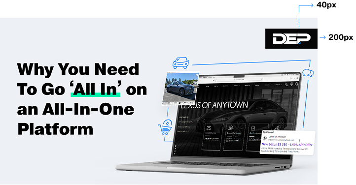
Blog badges must always be on the right, top corner of the blog image. Badges must be 200px wide and placed 40px from the top edge.


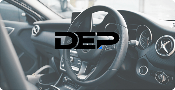
The logo letters, as well as the triangle, always need to stand out from the background.
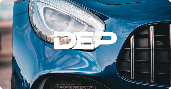
The triangle should never fade into the backround. If necessary, use one of the secondary logos with a black or white triangle to ensure the triangle doesn’t blend into the background.
The triangle is a defining component and should always be a different color than the letters.

Never use a drop shadow on the logo.
Never outline the logo or alter it’s design in any way.
Never rotate the logo.
Do not combine the primary and secondary logos together.