
Primary Font
Pragmatica should be used in most cases as the bolder, most prominent font.
Pragmatica should be used in most cases as the bolder, most prominent font.

Secondary font is MUST be used on websites and Google tools. These include Google docs, Google sheets, Google slides, and DEP corporate websites. Work Sans may also be used as a secondary font for body copy and subheaders


Do not apply harsh drop shadows to typography. Soft shadows may be added behind text to increase legibility over photos, but they should be well blended into the background.
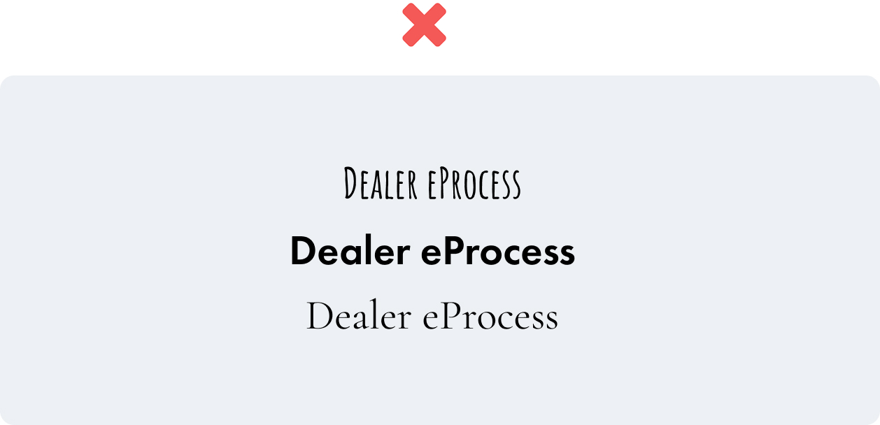
Do not use alternate fonts

Don’t use over style typography. Styling should be consistent and show clear hierarchy.
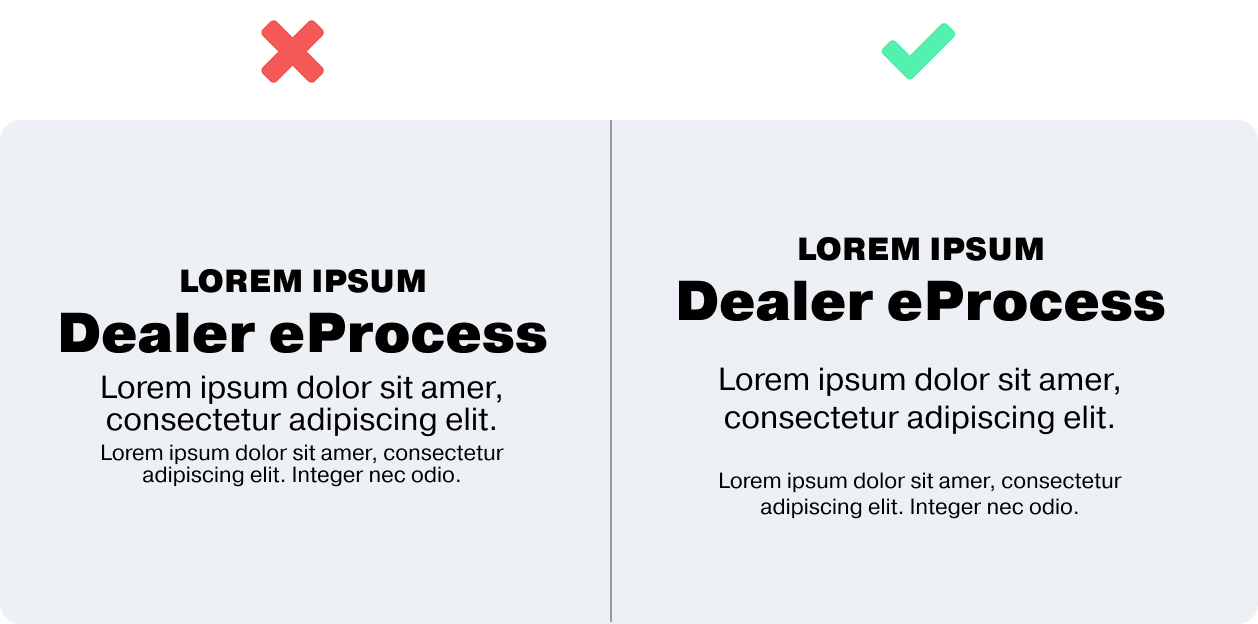
Don’t cram typography together. Allow space for breathing room around the text, and in the line height