
Color

Primary

Blue should be used as the main brand color, with green serving as visual accents. Salmon should be used very rarely in situations with dense information, such as infographics or presentations. If all 3 colors are used simultaneously, blue should be used for around 70% of the colored area, green for about 20%, and salmon for about 10%.
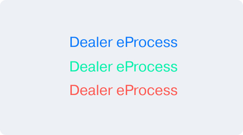
#0D7BFF

#00F1AC

#FF5A54

Neutrals

Use the provided set of neutral colors to maintain the overall cool toned color palette.

#000000

#141416

#26272B

#38393F

#60636D

#9599A3

#C2C7D3

#DADFE8

#EDF0F4

#FFFFFF

Tints/Tones

Tints and tones should be used when further color variation is required, or when the primary colors are hard to see (for example, blending in with a background image)

#114078

#104F9A

#0F5DBB

#0E6CDD

BASE

#2390FF

#1CA4FF

#3EBAFF

#61D1FF

#008461

#009F74

#00BB87

BASE

#73FFDA

#89FCE0

#B6FFF1

#CC3737

#E64946

BASE

#FF7673

#FF9696

Print

CMYK swatches must be used for any print collateral such as fliers, brochures, business cards, backdrops, etc.

CMYK
(85, 50, 0, 0)

CMYK
(75, 0 , 75 , 0)

Pantone
285C

Pantone
285C

Accessibility

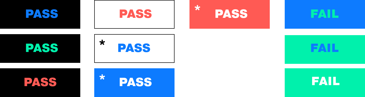
Ensuring color combinations match WCAG standards is important for accessibility and ease of reading for all users. In some specific cases, contrasts that fall below a AA standard may be used. It is recommended to use the designers judgement above all.

Multiple instances of 2 colors overlapping to show which pairings are acceptable and which are not

*Only bold weights above 20px font size.

Contrast ratios are intended to be used as general guidelines. User designer’s discretion as needed. In some cases, if a contrast ratio fails, using a bigger and bolder font may be legible.

Small and thin text in hard to read colors

Don’t use small, thin colored text. If colored text is needed, ensure it is large or bold enough to be legible.

Image with a large red banner

Don’t use incorrect colors. Exceptions can be made when cobranding with another company, such as Amazon or Google.

Image with too much light green

Don’t use green or salmon as predominant colors. These should only serve as accent colors .